
Why tiny text needs a different approach
Marking small parts is not just a matter of turning down the power and shrinking the font. When you are working on rings, tags, bushings, nameplates or precision components, the beam has to place each line where it belongs, with enough contrast to read it and enough control to avoid heat marks around it.
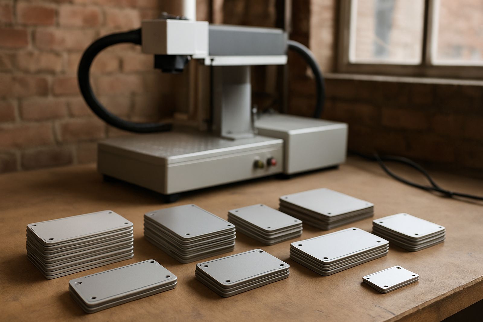
In South African workshops, tiny text is often needed for serial numbers, initials, batch codes, QC marks and compliance details. The challenge is practical: jewellery curves move under the beam, oily metal reflects light and fine lettering can close up if the focus is even slightly off. That is why tiny text marking starts with the part, not the machine. Know the material, the finish and the final use before you choose a setting.
- Use the smallest text size the product can honestly support, not the smallest size the software allows.
- Check whether the mark must be decorative, traceable or both.
- Test on the actual material, not a similar offcut that looks close enough.
Material matters more than most people think
Stainless steel, silver, brass, titanium and plated parts all react differently. On jewellery, a bright polished surface can show every tiny wobble in the beam, while a brushed ring may hide slight variation better but still needs clear edge definition. On engineering parts, deep black marking may be unnecessary if the only requirement is a readable code that survives handling, oils and cleaning.
For good results, the surface needs to be clean and consistent. Finger oil, polishing compound and buffing dust can change how the mark appears. On coastal shipments from places like Durban or Gqeberha, moisture can also affect stored blanks and fixtures. If the parts have sat in humid air, wipe them down before marking and keep them covered where possible.
Small text also depends on the finish you want after marking. A jewellery client may want a gentle, precise line that does not dominate the piece. An engineering client may want a deeper contrast that still reads after assembly and handling. Those are different jobs, even if the text looks similar on screen.
Font choice, line thickness and spacing
The cleanest tiny lettering uses a simple font with open counters and even stroke width. Thin decorative fonts may look elegant at full size but become a blur on small parts. The spacing between letters and lines matters just as much. If the gaps are too tight, the text can close up after marking and become hard to read under workshop lights.
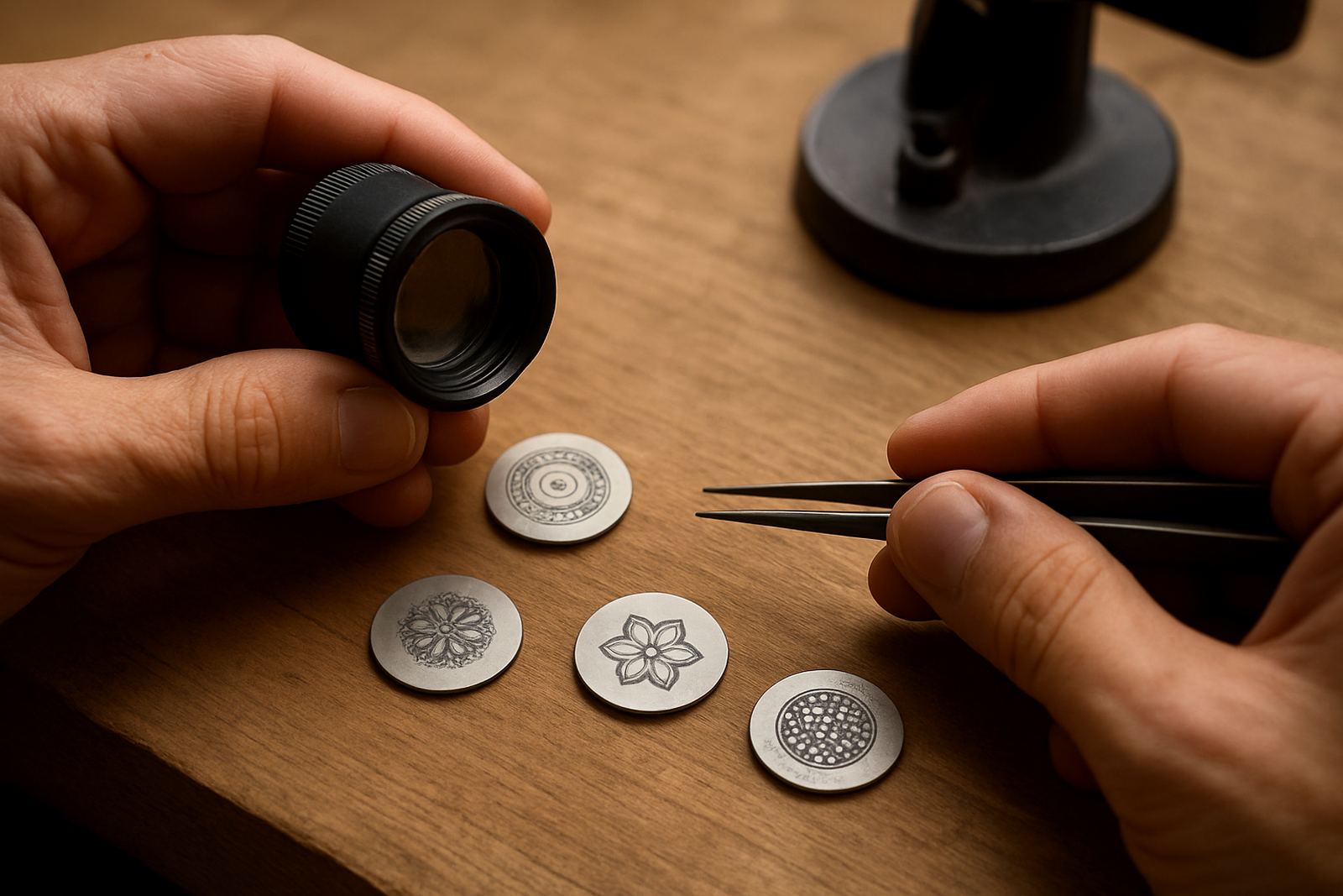
In practice, the best font is the one that survives the real world. Think about the angle of the part, the reading distance, and whether the mark will be viewed with the naked eye or under a loupe. For rings and pendants, a slight curve can help the mark sit naturally on the surface. For small metal tags, straight alignment usually gives better repeatability.
- Keep fonts plain and open.
- Use enough line spacing so letters do not merge.
- Reduce text height only after you have checked legibility on a sample.
- Avoid overcrowding a small surface with too much information.
A common mistake is trying to fit too many words into one tiny area. If the part is small, shorten the message. A short code that stays readable is more useful than a long line that nobody can decipher.
Fixture design keeps small parts under control
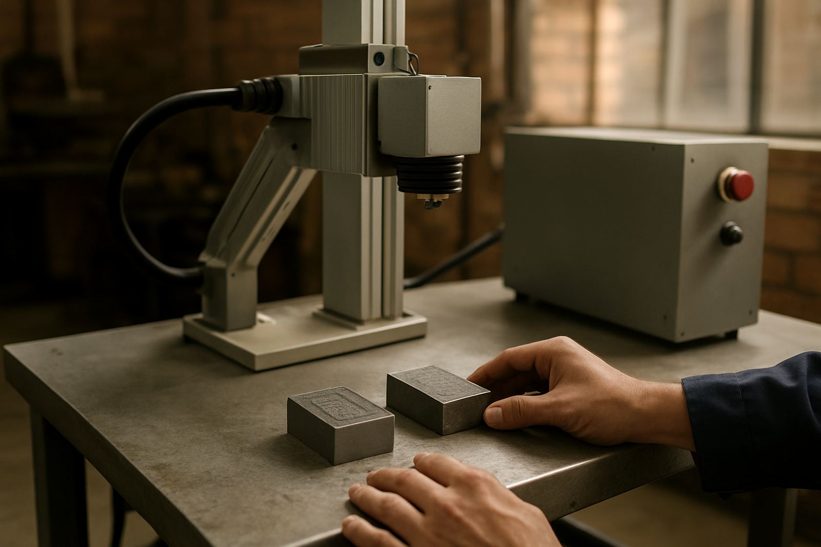
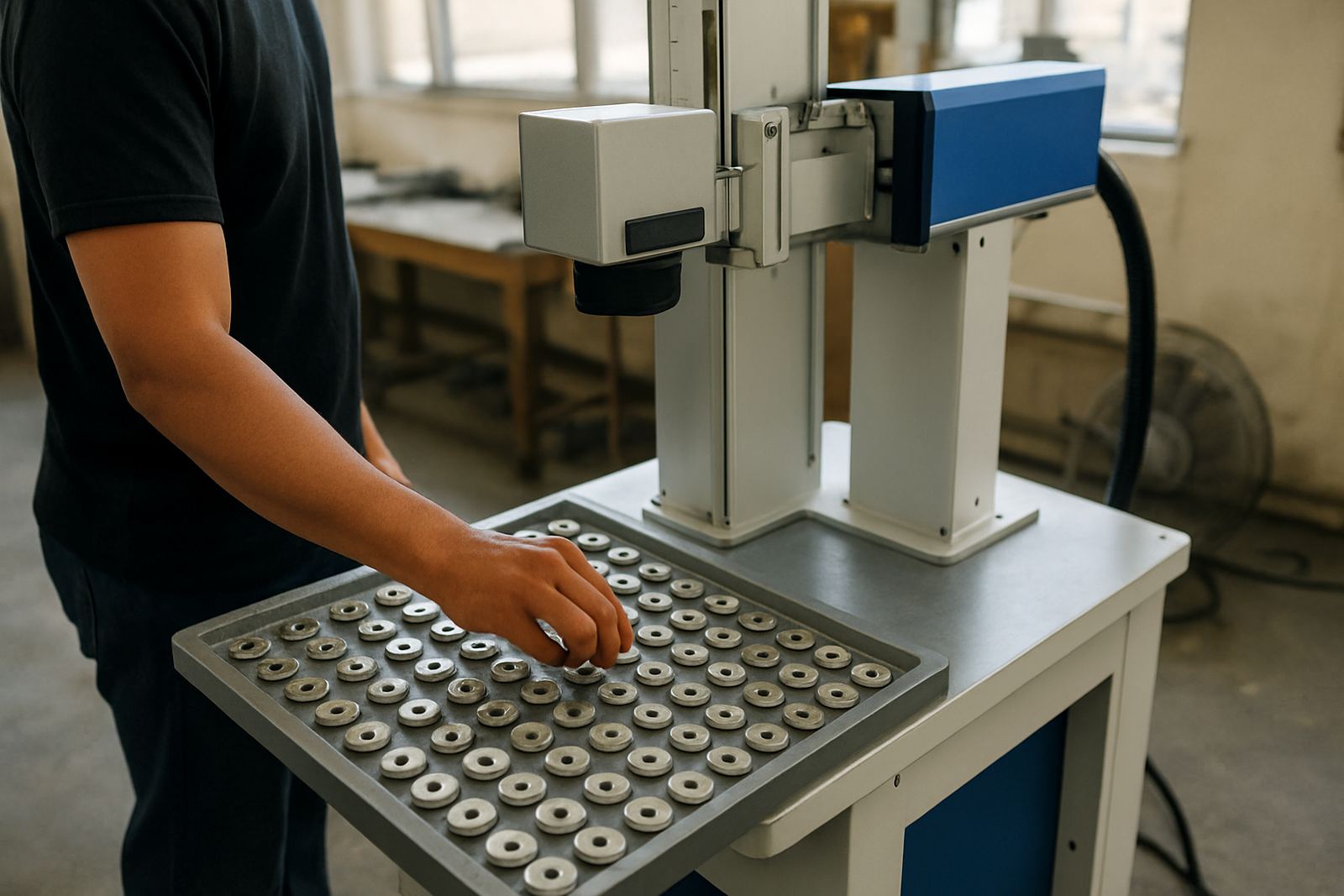
For miniature work, the fixture often matters as much as the machine itself. If a ring rolls, a tag twists or a small plate lifts by even a fraction, the mark shifts and the detail suffers. A proper holding solution keeps the part steady, repeatable and easy to load without damaging the finish.
In Wadeville and Jet Park workshops, we often see small parts being held with whatever is on hand. That might work for one-off samples, but it is a problem when you need the same mark 50 times in a row. A good fixture should suit the shape of the part, allow quick positioning and protect polished surfaces from scratches. It should also make sense for the operator using it every day, especially when load-shedding interrupts a shift and the job has to resume without a long reset.
Good fixture design usually includes:
- Positive location points so each part sits in the same place.
- Soft contact where polished or plated surfaces could mark easily.
- Clear access for the laser head and enough room for loading.
- Simple clamping that does not distort thin jewellery or small components.
Focus, pulse control and sample marking
Once the part is secure, the next step is focus. Tiny text is unforgiving if the focal point is off, even by a small amount. On curved surfaces, the focus may need adjusting across the mark area. That is where sample marking pays off. A short test on the same material saves time and reduces the risk of ruining finished stock.
Pulse control also matters. Too much energy can widen the mark and create a rough edge. Too little can leave the text faint and uneven. The right balance depends on the metal, the surface finish and the depth required. On some parts, the aim is a crisp surface mark. On others, a deeper engraving is needed for wear resistance. There is no one setting that suits every job.
We see better results when workshops keep a simple record of successful settings. Note the material, text height, power range, speed and focus position. That record becomes useful when the same order comes back six months later and the operator needs to match it quickly, without starting from zero.
What South African workshops should plan for
Local conditions shape the way tiny text jobs run. In industrial areas around Germiston, Boksburg and Isando, dust and vibration can affect alignment over time. In smaller workshops, power interruptions can interrupt a run and force a restart, so the marking process needs to be easy to recover. If the machine is used for jewellery, the environment should also be clean enough to protect polished parts from contamination before marking.
Practical planning helps prevent delays:
- Keep spare lenses, filters and cleaning cloths ready for routine care.
- Train operators to spot focus drift early.
- Store blanks and finished pieces separately.
- Allow extra time for set-up when the job includes curved or uneven surfaces.
For clients in Germiston and nationwide, support also matters after installation. Training should cover the machine, the software and the marking process itself, so the operator understands why one tiny change can alter the final result. That is especially useful for workshops that handle mixed work, from one-off jewellery items to production runs of numbered parts.
A local example from Wadeville to the rest of South Africa
One Wadeville client came in with a small batch of engraved rings and precision tags for a specialised assembly job. The brief sounded simple: make the lettering smaller, keep it readable and avoid marking the polished edges. After a few sample runs, the team adjusted the focus, changed the fixture contact points and simplified the text layout. The final result was cleaner, quicker to repeat and far easier to inspect under a loupe.
That is the point of tiny text marking. It is not about forcing extra detail onto a small surface, but about getting the detail to sit properly on the part. With the right setup, small text can look neat, survive handling and still do the job it was meant to do.
For businesses that need installation, operator training, software setup, preventive maintenance, breakdown repairs or remote assistance, the process is best handled as a full system rather than a single machine purchase. Small marks need small tolerances, and small tolerances need proper support.